3 Front Covers Analysis
The 3 front covers and contents pages I will be analysing for media language are:
-Current Affairs, current affairs genre


- Vogue, fashion genre
- The Big Issue, current affairs/news genre
CURRENT AFFAIRS
The cover(s) of Current Affairs is not particularly conventional or typical of the current affairs genre; as opposed to traditional covers that include previews of images involved in it's stories, it uses intriguing, artsy and humorous illustrations, this particular one somewhat unrelated to the feature cover articles. This creates a representation for the brand that is humorous and unique, drawing in and appealing to perhaps more middle to upper class young people, or college and university students. Current Affairs magazines are generally quite sophisticated, while also playful, and described as a "visual feast." This can be supported by its simple and clear layout and design, that is mixed with vibrant colour palettes, mostly serif fonts and typography, bold and fun mastheads, and most of all the incredible use of the visuals I mentioned previously that they are well-known for. The visuals involved in these magazines are what makes them stand out in the genre of current affairs, adding a sense of liveliness to the pages and the topics they discuss.
In this particular front cover, intertextuality is used to reference the current situation regarding the pandemic, the current state of politics and society, rounding up all of these events and controversies with one simple and humorous quote above the masthead that reads "the one thing left that isn't disappointing." This line shows that Current Affairs holds themselves to a high standard, but expresses this in a comedic way. It also creates a personal connection with the audience, as if recognising that times may be tough, but through it they will not disappoint.
VOGUE
The Vogue magazine is very conventional of it's genre, being one of the most high-end fashion magazines available on the market, including many typical fashion magazine features such as a photos hoot cover unique to the magazine, featuring a female celebrity, a sophisticated and serifed masthead, a coordinated colour palett e, much of which is significant to Vogue's iconography: especially the high-end photo shoots that feature on the cover of every magazine. The colour palette features mainly white and pink, which signify or quite directly suggest feminine qualities, creating a representation for the magazine that is also very feminine, and therefore creating an appeal towards high-end, females audiences. The featured cover articles such as "being a woman in Trump's America" raises topics of controversy surrounding women, perhaps furthering the representation of this magazine is slightly feminist.
Intertextuality is quite directly implied with the use of celebrity actress Claire Foy, referencing both herself as an actress and the show she features in 'The Crown,' this reference furthers the appeal to a high-end audience. Other intertextual references are also made to politics and Trump.
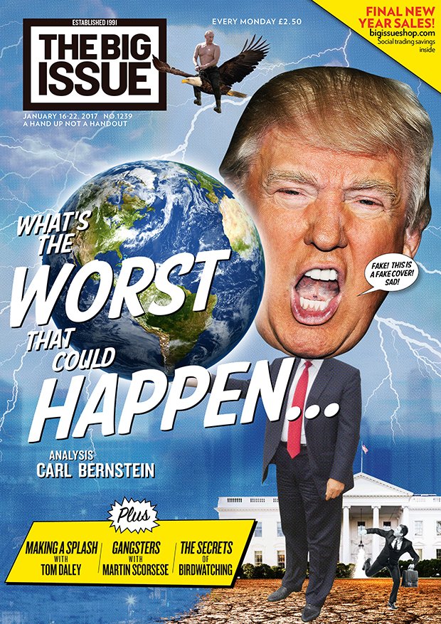
THE BIG ISSUE
The Big Issue is another example of a current affairs magazine, and is more conventional of it's genre than that of Current Affairs magazine. The Big Issue uses caricature images of celebrities and politicians to create a sense of humour that would perhaps be aimed it more lower to middle class consumers, and also creates some political bias which effects the representation of the Big Issue, and how they confront politics, in a more unsophisticated way, poking fun at certain figures, rather than detailed and in-depth discussion. The use of caricature images is also a cheaper alternative to original illustrations or photo shoot covers, meaning that the magazine in lower budget, and therefor mire affordable to consumers of a lower class.
The headline that extends across the whole page and uses intertextuality to reference the current social, economic and political situation regarding the pandemic and other factors, and references this in a comedic way, using a humorous mode of address to connect with readers. The typography is completely sans serif, again a more unsophisticated way of presentation compared to Current Affairs and other higher class magazines. The masthead is also in a sans serifed font, reflecting this representation onto the company themselves. The design and layout of the front cover is spread out across the page, not very symmetrically or orderly, emphasising again the production value of the magazine.
Thanks Mia. Remember you also have to analyse at least 3 contents pages as well. You will be producing magazne front covers AND contents pages, so understanding the codes and conventions of contents pages will help you.
ReplyDelete